The wall behind the sofa is the quietest decision in a shelter-magazine shoot and the one editors argue about longest. Get the pattern, the light, and the crop right and the room reads as a whole world; get it wrong and the whole spread looks like a furniture ad.




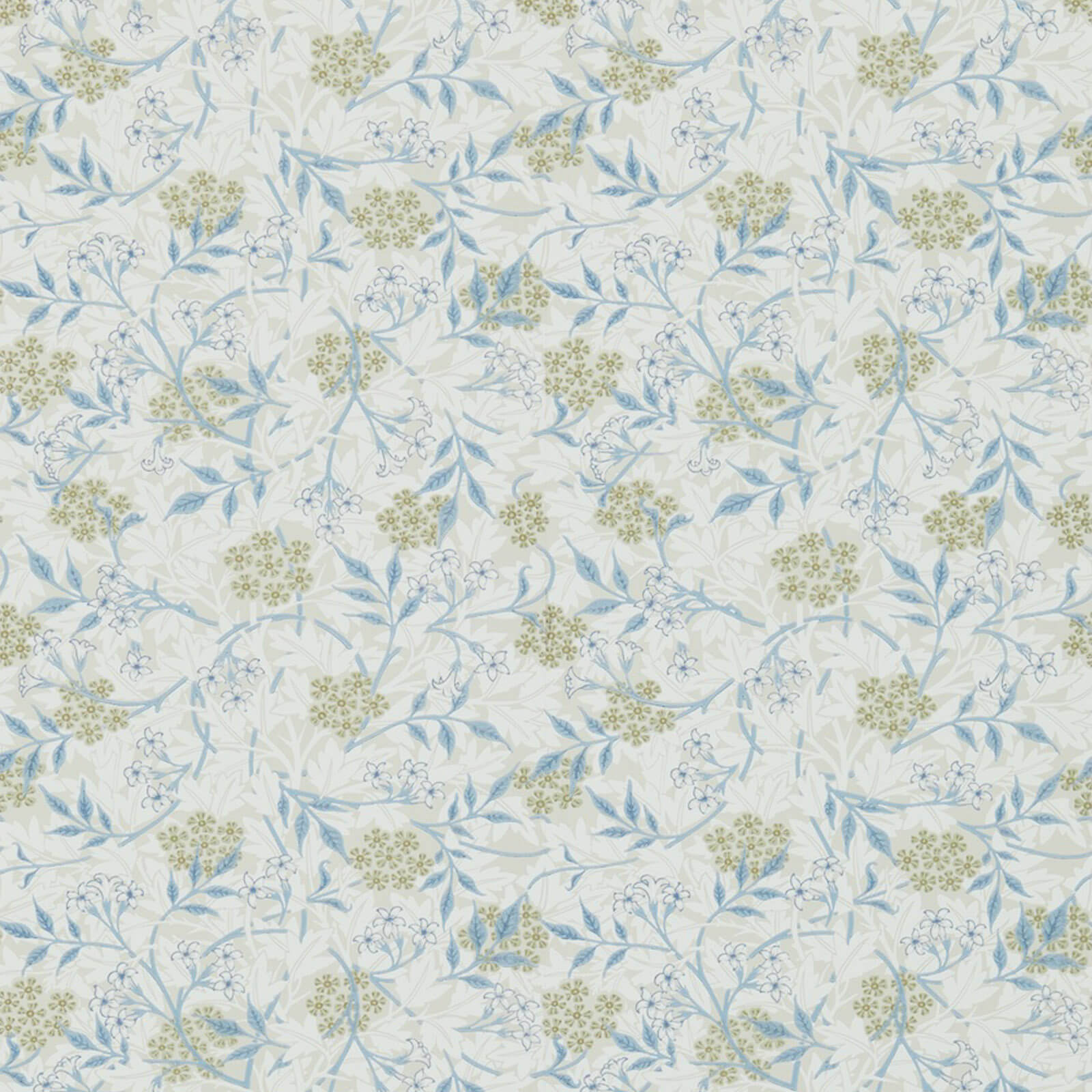
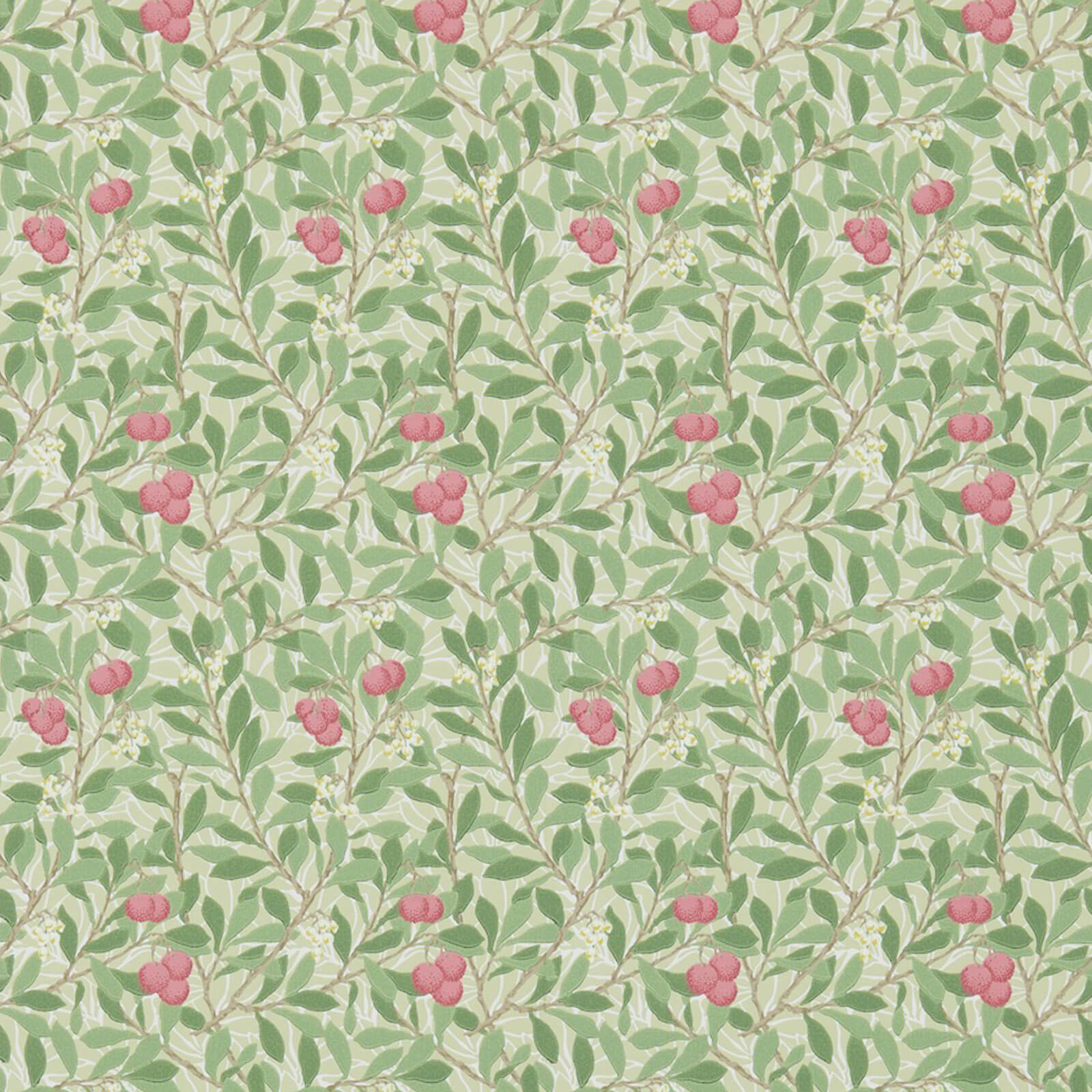
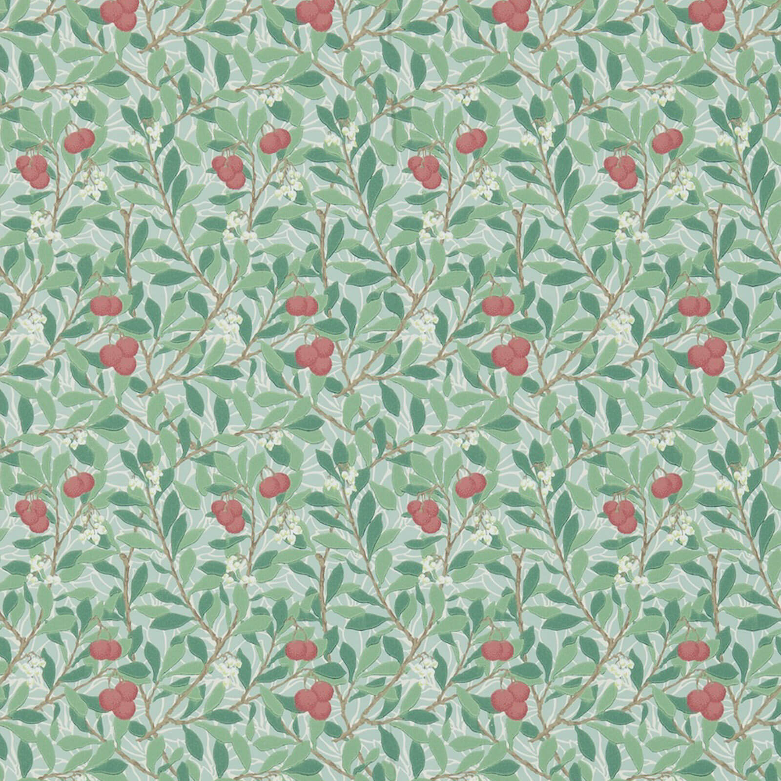
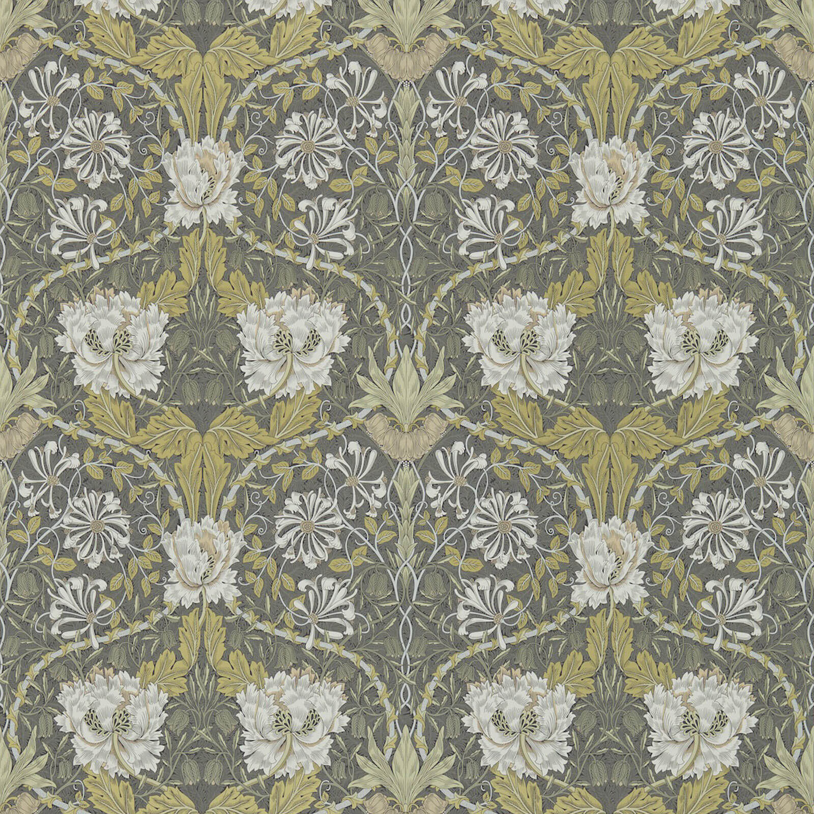
Why editors shoot the wall first
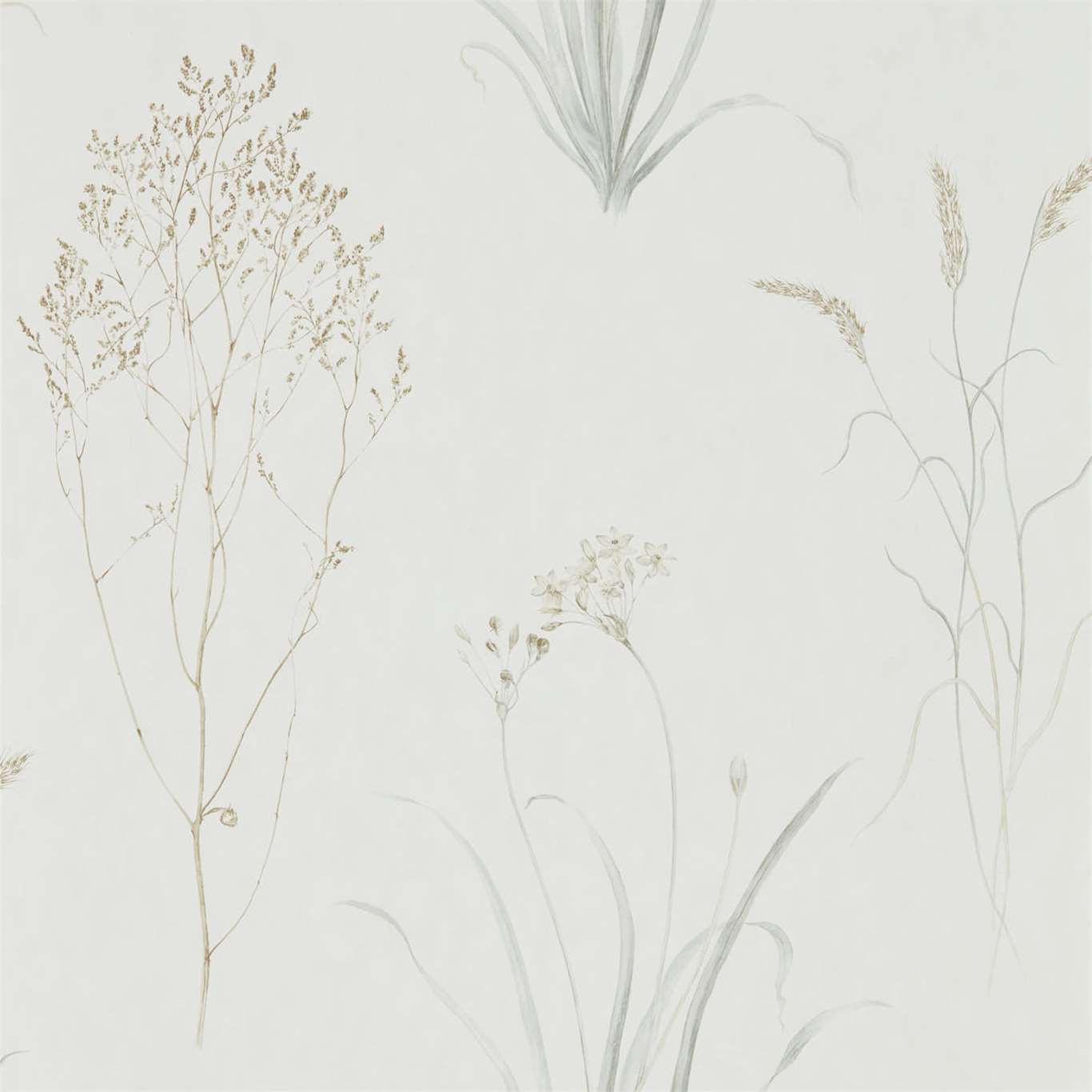
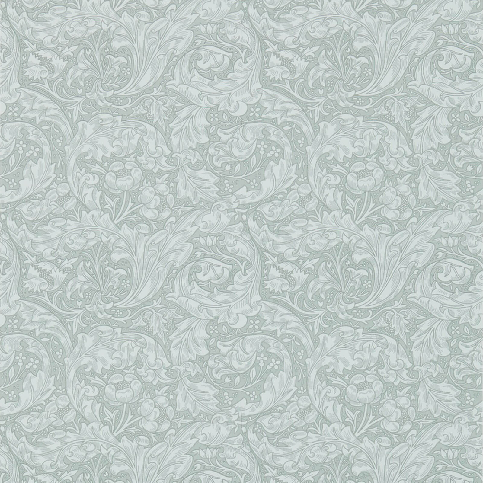
In the Elle Decor and Architectural Digest tradition, a room is built for the camera before it is built for the client. The wallcovering sets the value key of the frame: a deep lacquered grasscloth swallows light and makes brass and upholstery glow against it, while a chalky matte print bounces fill and lets an editor shoot with almost no strobe. Stylists choose the paper knowing whether the story runs in the light-drenched spring issue or the moody fall portfolio, because the same room photographs like two different houses depending on the wall's reflectance.
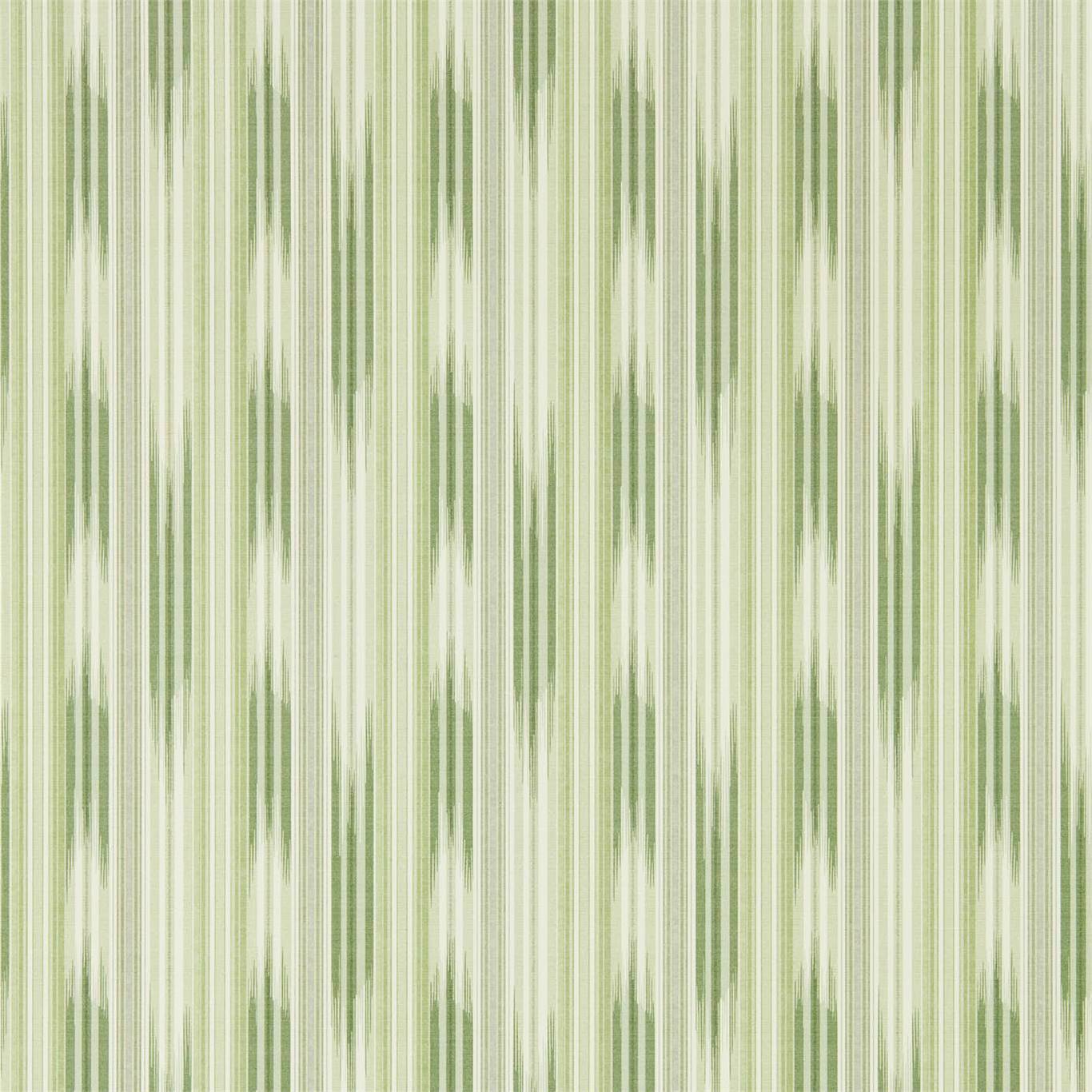
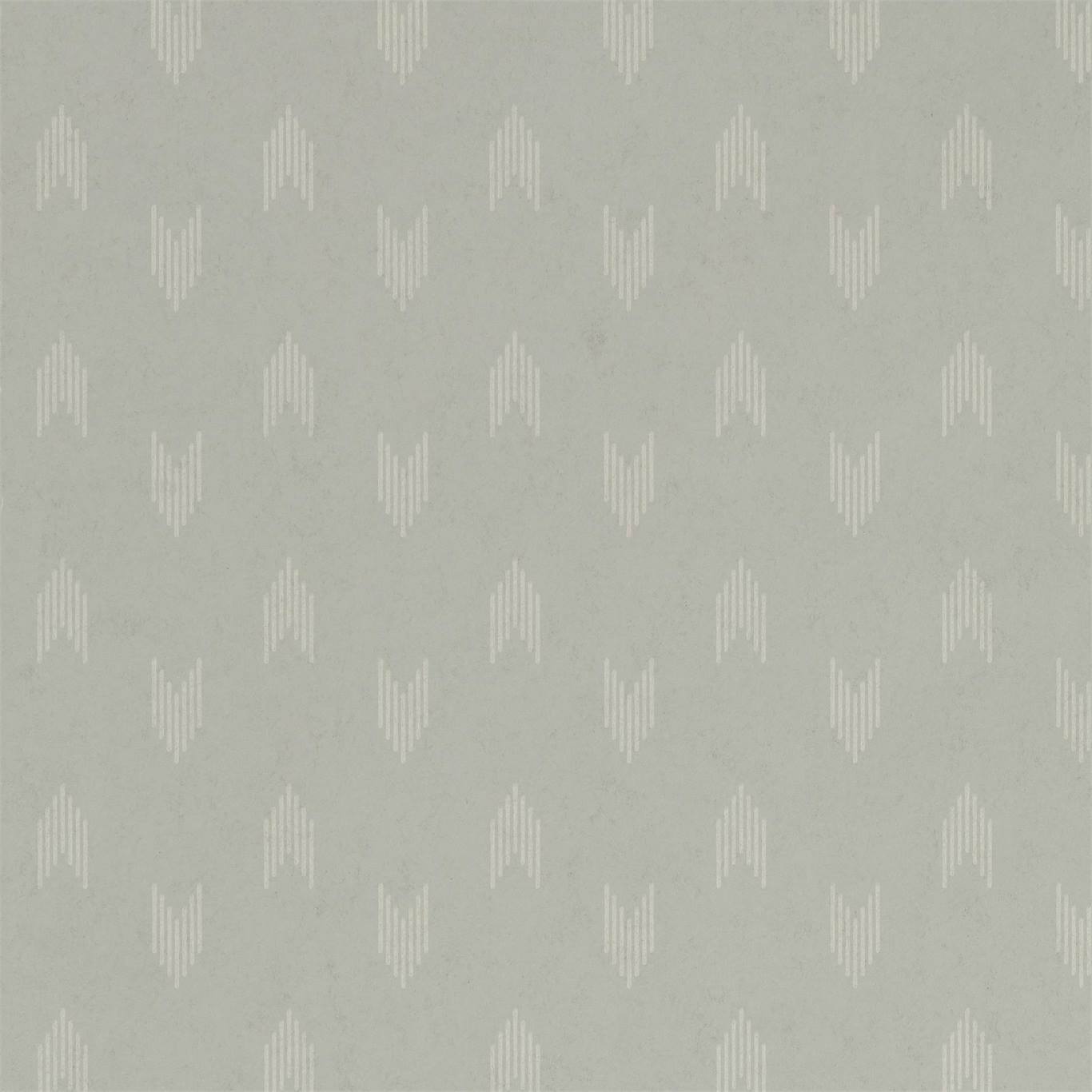
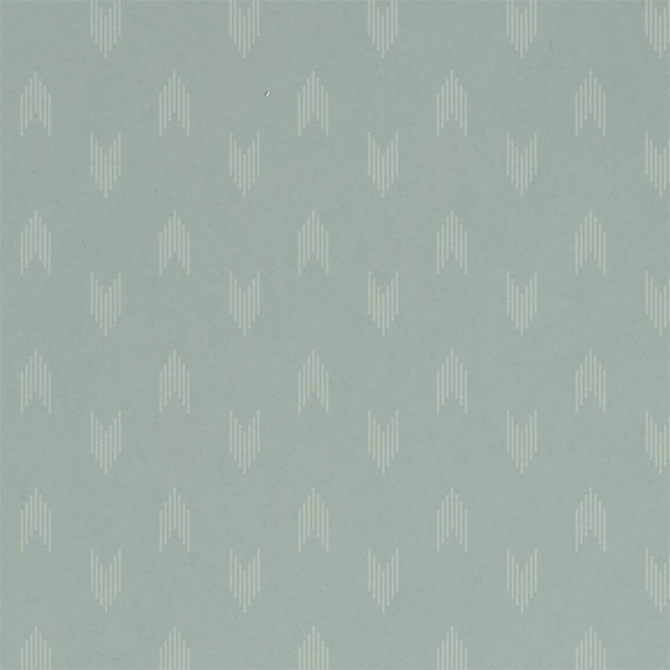
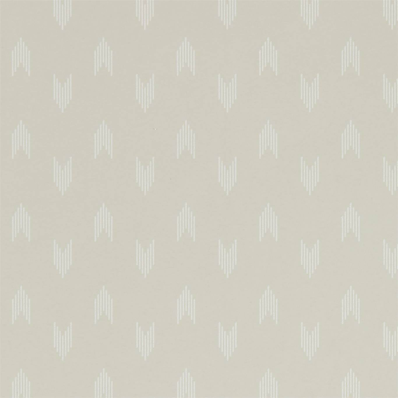
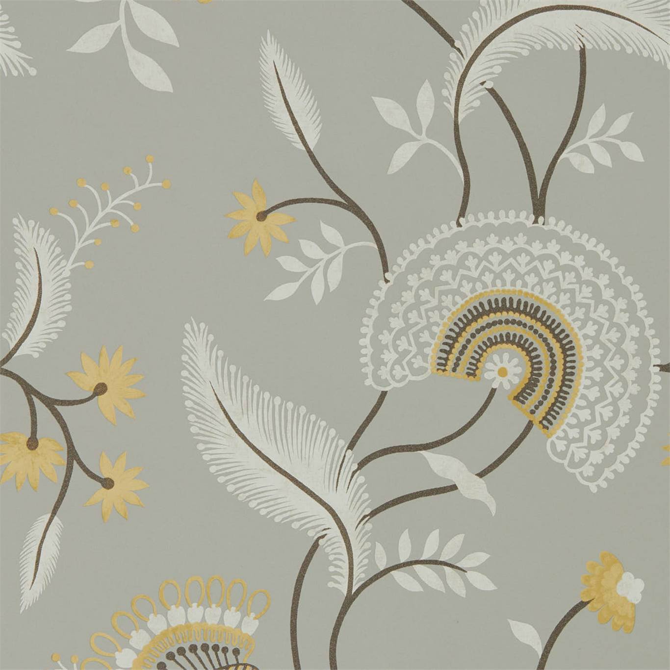
The pattern also solves the hardest problem in interiors photography, which is the empty upper third of the frame. A large-repeat botanical or a scenic panel gives the lens something to hold above the furniture line, so the shot doesn't die into flat paint at the picture rail. That is why so many memorable spreads use paper only from chair-rail to ceiling, or on a single accent wall the camera is angled to catch: the covering is doing compositional work, not just decorating.
Reading a spread like a stylist
Look at where the seams fall in a published photograph and you learn how the room was planned. A good stylist hangs the paper so a full pattern repeat lands dead center behind the hero object, and the drops on either side mirror out symmetrically. When a scenic mural is involved, the panel sequence is chosen so the most detailed passage sits at eye level in the frame, not lost behind a lamp.
Color discipline is the other tell. Editorial rooms rarely carry more than one loud surface, so if the wall is doing the talking, the textiles go quiet and tonal. Shelter magazines have trained a generation of readers to expect that one confident wall, three supporting neutrals, and a single hit of contrast, which is a formula you can lift straight from the page and apply to a real room.
From the page to your walls
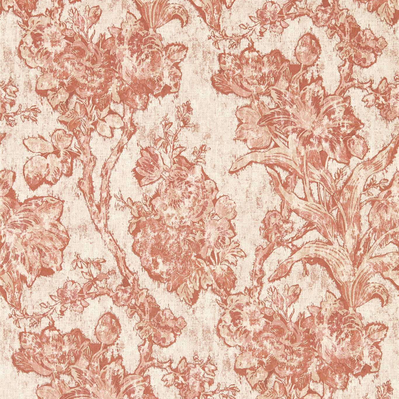
The trap in copying a magazine wall is scale. Photographers shoot with wide lenses that shrink a pattern, so a print that looks like a fine texture in a spread can read as an aggressive motif on your own eight-foot wall. Always order a large sample and pin it up for a day, watching it in morning and evening light before you commit, because the paper you fell for was lit by a crew you don't have.
The second lesson is restraint about surface. Editorial rooms photograph beautifully partly because the paper is hung on flat, well-prepped walls with crisp trim lines that the camera loves. A striking pattern over a lumpy wall telegraphs every flaw. Spend on the surface prep and the installer before you spend on the most expensive roll, and your room will hold up to the same scrutiny a printed page does.
Quick checklist before you order
- Light keyMatch paper reflectance to the room's light — matte for bright rooms, sheen or grasscloth for dim ones.
- Repeat sizeOrder a large sample; camera lenses shrink patterns that overwhelm a real wall.
- One loud surfaceLet the wall be the star and keep textiles tonal, the way spreads are styled.
- Seam planCenter a full repeat behind the hero object and mirror the drops outward.
- Prep the wallFlat, well-prepped walls with crisp trim are what makes editorial rooms photograph clean.
Frequently asked
What kind of wallpaper do interior magazines use?
A wide range, but editors favor large-repeat botanicals, grasscloth, and scenic panels because they fill the upper frame and control how light behaves in the shot.
Why does wallpaper look different in a photo than in person?
Photographers use wide lenses and controlled lighting that shrink patterns and even out reflectance, so a paper can read finer or moodier on the page than on your wall.
Should I copy a whole magazine room?
Copy the logic, not the literal room — one confident wall, quiet supporting neutrals, and a single contrast accent travels better than matching every object.
Read more
- What 'shelter magazine' actually means, and why the trade calls it thatThe industry term for the home-and-decor press has a specific meaning and a long lineage. A short field guide to the category that sets interior taste.
- House Beautiful at 1896 and the long American home-magazine habitThe United States has been publishing home magazines for well over a century. The oldest titles, and the ones that folded, explain the shape of the field today.
- Architectural Digest, Condé Nast, and the power of the AD100How the best-known name in the shelter press works: a century-old title, a global publisher, and an annual designer list that can move a pattern into demand.
- The decorator show house: where the magazines go shopping for trendsCharity show houses like Kips Bay let top designers build a room with no client to please. The shelter press covers them because that is where next season shows up first.
- From the print swatch to the Instagram gridFor a century, home trends traveled monthly by mail. The shift to social feeds changed the speed, the gatekeepers, and how a wallcovering pattern goes from unknown to everywhere.
- Reading a magazine room: what the styling isn't telling youPublished interiors are constructed for the camera. A short guide to the gap between an editorial photograph and a room you could actually build and live in.